
Websites for Mobile: The Complete Guide to Building High-Performance Mobile Experiences
Learning how to build websites for mobile is no longer optional — it is a fundamental requirement for modern online success. With more than half of global web traffic coming from smartphones, every brand, business, and creator must focus on delivering fast, beautiful, and user-friendly mobile website experiences. Whether you’re creating a personal portfolio, an online store, or a business landing page, mastering websites for mobile will determine how people interact with your content. In this guide, you’ll learn everything from mobile homepage design techniques to real mobile website examples that demonstrate what great mobile experiences look like.
Building websites for mobile means thinking beyond small screens. It’s about performance, accessibility, responsive layout flow, intuitive navigation, and mobile-first design. Your mobile visitors must be able to scroll smoothly, read clearly, and access information effortlessly. With the right principles, you’ll know how to create mobile friendly website design that performs brilliantly across all devices.
As you go through this guide, you’ll discover proven methods used by designers and developers around the world. You’ll see how mobile website design, performance optimisation, media queries, and layout rules combine to create some of the best mobile websites on the internet. Whether you’re upgrading an existing site or building a new mobile web page design from scratch, this guide will help you create experiences that are fast, engaging, and ready for the future.
Why Websites for Mobile Matter More Than Ever
The rise of smartphones has drastically changed how people interact with digital content. This makes understanding websites for mobile essential if you want to remain competitive online. Today’s users expect instant access, rapid loading speeds, and smooth browsing. A mobile friendly website not only improves user satisfaction, but also positively impacts your search engine ranking. With Google’s mobile-first indexing, websites that are not optimised for mobile face reduced visibility in search results.
Building websites for mobile requires a mobile-first mindset. Instead of adapting desktop designs for phones, start with mobile web design and scale upwards. This ensures clarity, speed, and usability. With mobile web page design, every element — text, images, buttons, spacing, and navigation — must be optimised to support touch interactions and one-handed usage.
Even eCommerce stores see major benefits when they shift to mobile friendly web design. Shoppers browse and buy more confidently when they interact with great mobile websites designed for clarity and speed. This is why businesses study mobile website examples from top brands to understand how the best mobile web design enhances user experience and boosts conversions.
Core Principles of High-Quality Websites for Mobile
To create excellent websites for mobile, you must first understand the essential principles that guide mobile site design. These principles ensure your website is usable, attractive, and consistent across all devices. They include mobile page design structure, simplified navigation, flexible grids, and optimised content hierarchy.
Good websites for mobile prioritise readability. This means using larger fonts, balanced line spacing, and clear text contrast. A mobile homepage design must communicate its value in only a few seconds, encouraging users to scroll or tap. Long paragraphs may feel overwhelming on small screens, so dividing text into short, scannable sections helps keep readers engaged.
Speed is another major factor. The best mobile websites load quickly, use compressed images, streamlined code, and minimal unnecessary scripts. Slow websites lose visitors before the first scroll. Understanding mobile phone web design performance optimisation ensures your users have a smooth and enjoyable experience.
Mobile Web Design vs Desktop Web Design
Many beginners assume that websites for mobile and desktop websites follow the same design rules, but they are fundamentally different. Desktop designs offer larger canvas sizes, multi-column layouts, and spacious navigation bars. In contrast, mobile web design must be compact, vertical, and focused. Mobile devices have limited screen space and rely heavily on touch gestures, meaning buttons must be larger, spacing must be generous, and content must be easy to explore with one thumb.
Study any mobile website list of top-performing websites, and you’ll notice consistent patterns: simplified headers, sticky navigation, collapsing menus, and vertically stacked layouts. These elements ensure that the mobile web page feels natural and comfortable to browse.
For developers, mobile-first design is a major shift. Instead of shrinking desktop layouts, you begin by building mobile web page design that functions perfectly on phones. Once this foundation is strong, you progressively enhance the layout for tablets and desktops. This results in good mobile websites that scale up beautifully and maintain consistent design language across devices.
Key Components of Successful Mobile Page Design
High-performing websites for mobile all share a set of common features. When applied together, these features create immersive mobile experiences that users enjoy navigating. Below are the core components that shape strong mobile web design strategies.
1. Mobile-Friendly Navigation
Navigation is one of the most important parts of mobile site design. Desktop menus often include multiple links across the top, but mobile screens can’t display these comfortably. This is why most great mobile websites use hamburger menus or sticky bottom navigation bars for quick access.
2. Touch-Friendly Buttons
Buttons, links, and inputs must be large enough for fingers — not just mouse pointers. This is a key best practice in mobile homepage design and mobile friendly website development.
3. Clear Content Hierarchy
Users should instantly understand what your page is about. Highlight key messages early on and use bold headings to improve scannability throughout your mobile web page.
4. Optimised Images
Sharp, fast-loading images are crucial in mobile web design. Slow images impact performance and reduce conversions, especially for mobile shoppers.
Examples of the Best Mobile Websites for Inspiration
Studying real websites for mobile gives you a deeper understanding of what works. Many brands invest heavily in creating compelling mobile experiences that enhance engagement, boost conversions, and increase customer loyalty. By reviewing mobile website examples, you will learn layout patterns, text spacing, and performance optimisation strategies.
Here are two global platforms known for their exceptional mobile friendly web design:
- Spotify — smooth mobile interface, visually appealing imagery, seamless navigation.
- Airbnb — exceptional mobile layout structure, fast-loading pages, intuitive search features.
These are widely recognised as best mobile web experiences due to their responsiveness, clear structure, and efficient performance. You can explore additional cool mobile websites using responsive showcase galleries that curate the best mobile website design samples from around the world.
Mobile Navigation Patterns That Improve Usability
Navigation is one of the biggest factors influencing user experience on websites for mobile. Desktop navigation menus often contain many elements, but mobile visitors require immediate clarity and simple access. This has led to several universal navigation patterns seen across the best mobile sites.
One of the most popular patterns is the hamburger menu. This collapses navigation into a three-line icon that expands when tapped. It’s clean, compact, and ideal for mobile homepage design. Another pattern is bottom navigation — a bar placed at the bottom of the screen for easy thumb access. Many best mobile web pages use bottom navigation because users naturally rest their thumbs near the bottom edge of the phone.
Most designers now combine both: a top hamburger menu for additional items, and bottom icons for the most important actions. This combination delivers powerful usability and supports creating great mobile web design that feels intuitive and modern.
Essential Performance Principles for Mobile Friendly Websites
Performance is a major ranking factor and a critical part of building strong websites for mobile. Mobile networks vary in speed, and users expect fast loading times. If your site takes more than three seconds to load, most visitors will leave. This means reducing file size, compressing images, and removing unnecessary scripts.
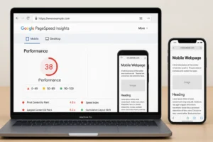
Many developers studying mobile phone web design rely on Google PageSpeed Insights and GTmetrix to evaluate performance bottlenecks. These tools show which elements slow down your mobile webpage, enabling targeted optimisation.
High-performing websites for mobile also limit pop-ups and avoid heavy animations that impact touch interactions. When you build for speed, your site naturally becomes part of the good mobile websites category that users enjoy exploring.
Mobile Homepage Design Best Practices
The homepage is the most important element of websites for mobile. It sets the tone for the entire user experience. Your mobile homepage design must immediately communicate purpose and value. This means using clear headings, strategic CTAs, short paragraphs, and visually appealing imagery.
Good mobile homepage layouts answer the most important questions first: What do you offer? How can users explore your site? Why should they trust your content? These are the principles reflected in the best mobile website design examples online.
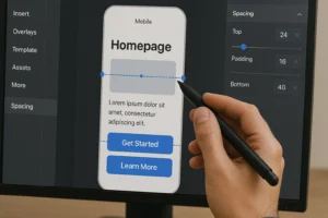
Mobile homepage sections should be vertically stacked with generous padding so users can scroll easily. Avoid clutter and use clear spacing to create a frictionless, enjoyable browsing experience.
A Helpful Reference Table for Mobile Website Design
The following table summarises key features that define high-quality websites for mobile. These elements represent the foundation of the best mobile web experiences on the internet.
| Category | Key Mobile Design Features |
|---|---|
| Navigation | Hamburger menus, bottom navigation, compact headers |
| Visual Layout | Single-column layout, large text, generous spacing |
| Performance | Fast loading, compressed images, clean code |
| User Experience | Touch-friendly buttons, clear CTAs, minimal clutter |
Mobile Web Page Content Placement Strategy
Content placement plays a massive role in the success of websites for mobile. Mobile screens display content vertically, so your most important information must appear early. Users typically scroll in predictable patterns — fast, brief swipes that scan for value. This makes the top third of your mobile web page crucial for engagement.
When creating websites for mobile, avoid burying essential information deep in the layout. Instead, use strategic positioning: strong headlines, key benefits, buttons, and important visuals should be placed near the top. This is a common technique used in best mobile web design strategies.
Also consider incorporating collapsible sections (accordions) for long-form content. This allows users to expand only what they want to read, reducing the visual load of your mobile web page design.
If you want to read more Amazing Articles like this, Click Here.


Frequently Asked Questions About Websites for Mobile
1. What makes websites for mobile different from desktop sites?
Websites for mobile differ significantly from desktop websites because they must be designed for smaller screens, touch-based navigation, and limited processing power. Mobile website design prioritises vertical layouts, larger buttons, and simplified structures that make browsing comfortable on smartphones. On mobile devices, users expect fast load times, clear typography, and easy scrolling without zooming in or pinching the screen. Unlike desktop layouts that support wide, multi-column structures, mobile web design relies heavily on single-column arrangements to maintain clarity and consistency.
Mobile friendly website design also focuses on performance. Slow-loading mobile web pages often lead to high bounce rates, so optimising images, compressing files, and removing unnecessary scripts becomes essential. A well-built mobile web page design ensures that users can access content immediately, no matter their connection speed. When you browse the best mobile websites online, you’ll notice how they prioritise speed, clarity, and intuitive features. These are not optional — they’re essential for creating great mobile websites that satisfy modern users and perform well in search engine rankings.
In short, websites for mobile must be designed with a mobile-first mindset that respects how people use their devices: quickly, on the move, and with clear intent. Good mobile sites simplify everything while keeping functionality strong.
2. Why is mobile-first design important when creating websites for mobile?
Mobile-first design is essential when building websites for mobile because it ensures that the core user experience performs well on smartphones—the device type most people use daily. Instead of shrinking a desktop website down to mobile size, mobile-first design starts with mobile web page design and scales upward to tablets and desktops. This approach focuses on essential content and streamlined layouts that improve usability, readability, and design consistency.
Using mobile-first principles also enhances performance. When designers prioritise mobile friendly website structures, they typically use more efficient coding practices and smaller assets. This reduces load times, improves responsiveness, and eliminates the clutter often seen when desktop designs are merely adapted for mobile. Many mobile website examples from top brands reflect this approach, showcasing clean visuals and intuitive mobile homepage design that feels purposeful and elegant.
Mobile-first design also aligns with Google’s mobile-first indexing strategy. If your site performs poorly on mobile, your search ranking may drop. By prioritising mobile web design early in the development process, you create good mobile websites that satisfy both users and search engines. This foundation supports scalability, ensuring your site looks beautiful on every device.
3. What features define good mobile website design?
Good mobile website design is defined by clarity, simplicity, performance, and accessibility. The best mobile websites make navigation easy with touch-friendly buttons, minimal menus, and clear visual hierarchy. Users should immediately understand where to tap, scroll, or explore without confusion. This is why mobile page design often focuses on vertical layouts, large text, and strategic spacing, ensuring all content appears clean and readable.
Another important feature of websites for mobile is speed. Fast-loading mobile sites significantly improve user satisfaction and engagement. Lightweight images, compressed files, and streamlined code contribute to a mobile friendly website that loads in seconds, even on slower cellular networks. Many great mobile web design examples incorporate lazy loading, image compression, and reduced JavaScript.
A good mobile web page should also support intuitive gestures such as tapping, swiping, or scrolling. Content must be easy to interact with using fingers rather than a mouse. When you explore any mobile website list, you’ll notice that the best mobile sites rely on thoughtful spacing, clean layouts, and minimal complexity. These principles help create mobile web pages that feel natural and enjoyable to use.
4. How can I make my website mobile friendly?
To make your site mobile friendly, you must first adopt a responsive layout that adjusts automatically to different screen sizes. This is the starting point for websites for mobile. Use responsive CSS frameworks like Bootstrap or Tailwind, or build your own layout system using Flexbox and CSS Grid. This ensures your mobile web page design adapts smoothly whether users browse on an iPhone, Android device, or tablet.
Next, optimise content for readability. Increase font sizes, add spacing between elements, and avoid long text blocks. Touch-friendly buttons, simplified menus, and collapsible sections help users navigate easily. These are essential steps in mobile homepage design. Another key technique is optimising images: compress them, serve modern formats (like WebP), and ensure they adapt to different screen resolutions.
Finally, test your site using real devices or mobile simulation tools. This helps ensure your mobile phone web design remains consistent and user-friendly across platforms. When done well, your site becomes part of the good mobile websites that users enjoy browsing.
5. What are examples of the best mobile websites today?
The best mobile websites are those that deliver exceptional performance, intuitive navigation, and visually appealing layouts. Some leading examples include:
— Airbnb: Beautiful mobile homepage design, fast loading, clean images, and clear navigation.
— Spotify: Seamless mobile web design, bold visuals, and easy-to-access menus.
— Amazon: Efficient product browsing, optimised mobile web pages, and fast shopping experience.
Each of these mobile website examples demonstrates best practices in performance optimisation, spacing, and user-focused layout decisions. They showcase how websites for mobile can adapt to different screen sizes without losing quality. These platforms rely on mobile-first principles to create predictable browsing experiences, ensuring users can explore products, content, or features quickly and comfortably.
Studying these best mobile web pages can help you improve your own site. Notice how they balance visuals, speed, and simplicity. These features make them consistently appear in mobile website lists showcasing award-winning mobile friendly web design.
6. How important is speed for websites for mobile?
Speed is one of the most important performance metrics for websites for mobile. Mobile users expect lightning-fast loading times, and even a one-second delay can significantly increase bounce rates. With mobile networks often being slower than Wi-Fi, optimisation becomes crucial. Fast websites result in better user experiences, higher engagement, and improved search engine rankings.
Google uses mobile performance as a ranking factor, meaning your mobile web design must be optimised for speed if you want to appear higher in search results. This includes compressing images, minifying CSS and JavaScript, enabling browser caching, and using lightweight code structures. These improvements ensure your mobile friendly website loads quickly even on older devices or weaker signals.
Most of the best mobile sites use performance techniques such as lazy loading, content delivery networks (CDNs), and responsive image sizing. When your mobile web page loads instantly, users are more likely to explore your content, improving conversions and retention.
7. What role does navigation play in mobile web design?
Navigation is a critical part of building websites for mobile because it directly affects how users move through your content. Mobile screens are smaller, so navigation must be concise and easy to access. Common navigation patterns include hamburger menus, bottom navigation bars, sticky headers, and collapsible sections—all designed to support touch-based interactions.
On the best mobile websites, navigation is always visible or easy to access with one thumb. The placement and design of navigation elements determine whether users feel frustrated or comfortable. For example, bottom navigation bars have become popular because they align with natural thumb movements. Many mobile website examples use these bars to highlight key actions like home, search, or shopping cart.
Clean, intuitive navigation contributes significantly to creating good mobile websites. When users can move effortlessly between pages, they stay longer, engage more, and convert at higher rates. Navigation is not just visual — it’s functional, strategic, and essential to mobile friendly web design.
8. How can I optimise images for mobile websites?
Images are often responsible for slowing down websites for mobile, which is why optimisation is essential. The first step is resizing images appropriately. Instead of serving large desktop images, use responsive image formats that adjust to device widths. Modern formats like WebP or AVIF offer excellent quality at smaller file sizes, improving mobile page design performance.
Another key technique is lazy loading. This ensures images load only when users scroll to them, reducing the initial load time of your mobile web page. Compression tools also play a major role. Online compressors and plugins help you reduce file size without losing clarity, a common strategy used in best mobile website design workflows.
Finally, include descriptive alt text for accessibility and SEO. Optimised images not only load faster but also improve ranking potential. When done correctly, your site will behave like the best mobile web experiences, delivering crisp visuals with exceptional speed.
9. How do responsive frameworks help with mobile web development?
Responsive frameworks are extremely useful when creating websites for mobile. They provide pre-built grids, layouts, and components that automatically adjust to screen sizes. Frameworks like Bootstrap, Foundation, and Tailwind CSS make it easier to build mobile friendly websites without reinventing foundational design structures.
These frameworks allow designers to focus on content and user experience rather than layout logic. They also help standardise spacing, typography, and navigation patterns. When studying mobile website examples, you’ll often find that many follow consistent grid patterns—thanks to responsive frameworks.
Using a framework accelerates development and ensures your mobile site design remains clean and structurally sound. This results in good mobile websites that look professional and maintain consistency across devices.
10. What are common mistakes to avoid when creating mobile sites?
When creating websites for mobile, beginners often make mistakes that harm usability and performance. One common error is using overly small text or tiny buttons, which makes mobile navigation difficult. Another mistake is cluttering the layout with too many elements. Mobile screens require simplicity; therefore, every item must have a clear purpose.
Slow-loading pages are another major issue. Heavy images, uncompressed files, and excessive scripts slow down a mobile friendly website. This drastically affects user satisfaction and ranking. Additionally, some sites fail to optimise touch interactions, leading to accidental taps or difficulty selecting items. Such problems can negatively impact the usability of mobile web pages.
Ignoring spacing and alignment is another problem. A well-organised mobile web page design relies on clean structure, adequate padding, and readable typography. Avoiding these mistakes will help you build mobile sites that perform like the best mobile web design examples online.
11. How can I create mobile friendly forms?
Forms are a vital part of websites for mobile, especially for businesses that rely on sign-ups, purchases, or inquiries. To make mobile forms user-friendly, use large input fields, simple layouts, and minimal required entries. Touch keyboards should match the input type — numeric keyboards for phone numbers, email keyboards for email fields, etc. This is a key principle in mobile web page design.
Break long forms into smaller sections or use multi-step layouts. A clean, minimal approach increases completion rates. Autofill support is also essential for mobile friendly web design. When implemented correctly, forms load quickly and work smoothly on all devices, making your site part of the best mobile websites category.
Clear labels, error messages, and submit buttons enhance user experience. A strong mobile form can drastically boost conversions, especially on websites for mobile where simplicity and clarity are essential.
12. Why do some mobile websites look better than others?
The best-looking websites for mobile use consistent spacing, appealing typography, clean colour palettes, and minimalist visual hierarchies. Sites that look cluttered or chaotic typically lack these design fundamentals. The difference often comes down to planning: developers of great mobile websites intentionally keep their layouts clean and their content focused.
Performance also plays a visual role. High-quality mobile website design includes fast-loading images, smooth transitions, and responsive layouts. Slow or poorly rendered visuals can make even good designs look bad. Additionally, many cool mobile websites incorporate subtle animations or micro-interactions that enhance experience without overwhelming the user.
The best designs prioritise readability and simplicity. By combining strong visual hierarchy with performance optimisation, these best mobile sites create experiences that feel modern, polished, and enjoyable.
13. How do I test websites for mobile across different devices?
Testing is an essential step in creating websites for mobile. Begin by using responsive design tools in browsers such as Chrome DevTools, Safari Web Inspector, or Firefox Developer Tools. These simulators let you preview mobile layouts across common screen sizes. However, real-device testing remains the most accurate method because it reveals actual touch behaviour, scrolling, and performance.
Tools like BrowserStack or LambdaTest allow you to test mobile web pages on hundreds of virtual devices without owning them physically. You can check how your layout behaves on various iPhones, Android models, and tablets. This helps ensure your mobile homepage design remains consistent.
Testing ensures your site behaves like the best mobile web pages online. It helps uncover issues such as overlapping content, broken menus, or slow loading elements. Thorough testing is the key to building great mobile experiences.
14. What layout patterns work best for mobile websites?
The most effective layout patterns for websites for mobile are simple, single-column structures. Single-column layouts allow content to flow vertically in a clean and predictable manner, making reading and scrolling easier. This approach forms the foundation of mobile web design and ensures consistent user experience across devices.
Card-based layouts are also popular. They organise content into clear sections that stack naturally on mobile screens. This is common in mobile website examples for blogs, eCommerce stores, and portfolios. Cards help maintain visual consistency while presenting information clearly.
Another effective pattern is the hero-section-first layout, where the main heading, short description, and call-to-action appear at the top. This is seen in many of the best mobile website design examples online. These patterns are reliable ways to create good mobile websites that feel intuitive and polished.
15. How long does it take to build a mobile friendly website?
The time required to build websites for mobile depends on complexity, features, and design requirements. Simple informational sites with basic mobile homepage design may take a few days, while more complex sites with advanced mobile web page design features may take weeks. The timeline also depends on whether you’re using a responsive framework, building custom mobile friendly website design, or outsourcing development.
If you study mobile website examples, you’ll notice that the most successful designs come from careful planning and iterative improvements. Testing, optimizing images, building touch-friendly features, and refining performance all contribute to the development timeline. Complex eCommerce sites or interactive mobile web pages often take longer due to detailed functionality.
Regardless of duration, focusing on high quality ensures your site ends up among the great mobile websites that users trust and enjoy.
Final Takeaway
Mastering websites for mobile means embracing clarity, speed, and user-focused design. The more you understand how people interact with mobile devices, the more powerful your website becomes. Whether you’re creating a simple landing page or a full-scale online platform, investing in mobile friendly website design ensures that every visitor receives a smooth, engaging, and enjoyable experience. Great mobile web design doesn’t just look good — it builds trust, improves rankings, and moves your brand forward.