SaaS Home Page: How to Build a High-Converting Landing Experience That Sells
Your SaaS home page is the virtual front door to your product. It’s where you greet potential customers, explain what you do, and persuade them to stick around. In the world of software-as-a-service, where competition is fierce and attention spans are short, your homepage isn’t just a welcome mat—it’s a make-or-break conversion engine.
In this article, we’ll dive deep into everything you need to build an exceptional SaaS home page that attracts, informs, and converts. You’ll learn the essential elements of SaaS website design, discover the best SaaS website examples, and get a roadmap to creating a homepage that sets your brand apart.
| Section | What to Do | What Not to Do | Why It Matters |
|---|---|---|---|
| Hero Section | Use a clear, bold headline, short subheading, and a strong CTA | Don’t use vague messaging or bury the CTA | Captures attention in the first 5 seconds |
| CTA Placement | Place call-to-action buttons above the fold and throughout the page | Don’t place a single CTA only at the bottom | Encourages conversions at multiple touchpoints |
| Product Visuals | Include screenshots, videos, or interactive previews | Don’t rely on text alone to describe product | Helps users visualize the platform quickly |
| Feature Highlights | Focus on benefits and outcomes, not just technical specs | Don’t list features without context | Shows how your SaaS solves real problems |
| Social Proof | Add logos, testimonials, case studies, and review badges | Don’t omit trust signals | Builds credibility and user trust |
| Mobile Optimization | Design with responsive layout and touch navigation in mind | Don’t ignore mobile users | Over half of users access sites from mobile |
| Visual Design | Keep the design clean, with whitespace and consistent branding | Don’t clutter the layout or use too many colors | Improves readability and brand perception |
| Page Speed | Optimize image sizes and use a fast server or CDN | Don’t let heavy scripts slow your homepage | Fast load times improve user experience and SEO |
| SEO Strategy | Use keywords like “saas home page”, include ALT tags, and internal links | Don’t neglect metadata or page hierarchy | Improves your homepage’s search engine ranking |
| Testimonials and Reviews | Showcase real feedback with names, photos, and results | Don’t use fake or generic quotes | Enhances authenticity and trustworthiness |
| Trust Elements | Include badges (SSL, compliance, integrations) and data security notes | Don’t forget about security or privacy clarity | Demonstrates professionalism and user protection |
| Navigation & Footer | Add sticky nav bar and footer with links to contact, blog, and pricing | Don’t make essential info hard to find | Aids in site usability and visitor flow |
| Blog or Resources | Link to helpful blog content that educates and nurtures leads | Don’t leave content marketing off your strategy | Drives organic traffic and establishes authority |
| SaaS Website Examples | Study top brands like Dropbox, Notion, and Airtable for UI/UX inspiration | Don’t blindly copy—adapt what works | Learning from the best helps you stand out strategically |
| Visual Hierarchy | Use large headlines, medium subheadings, and smaller body text for clarity | Don’t use inconsistent font sizes or styles | Improves content scannability and professionalism |
Why Your SaaS Home Page Matters More Than You Think
In many cases, your SaaS home page is the first and only chance to make an impression. It must:
- Clearly articulate your product’s value proposition
- Build trust through design, testimonials, and branding
- Encourage users to take the next step (signup, demo, or trial)
According to Nielsen Norman Group, visitors spend less than 10 seconds deciding whether to stay on a webpage. So, your SaaS site has to grab attention immediately.
The Core Components of a Winning SaaS Home Page
An effective SaaS home page isn’t just beautiful; it’s functional. Here’s what you must include:
| Section | Purpose |
|---|---|
| Hero Section | Grab attention and summarize your core offering in one sentence |
| Call-to-Action (CTA) | Encourage the next step: start trial, request demo, or sign up |
| Product Features | Showcase key benefits and capabilities |
| Social Proof | Include logos, testimonials, or reviews |
| Product Visuals | Images, GIFs, or videos to show the product in action |
| Integration/Trust Elements | Mention security, compliance, partners, or integrations |
| Footer | Include links to About, Contact, Blog, and Legal |
Hero Section: Hook Them Instantly
Your hero is the most critical part of your SaaS home page. In just a few words, it should:
- Explain what your product does
- Speak directly to your target audience
- Offer a strong CTA
Example:
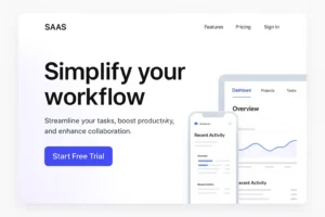
“Automate Your Invoicing in Minutes. Try Free for 14 Days.”
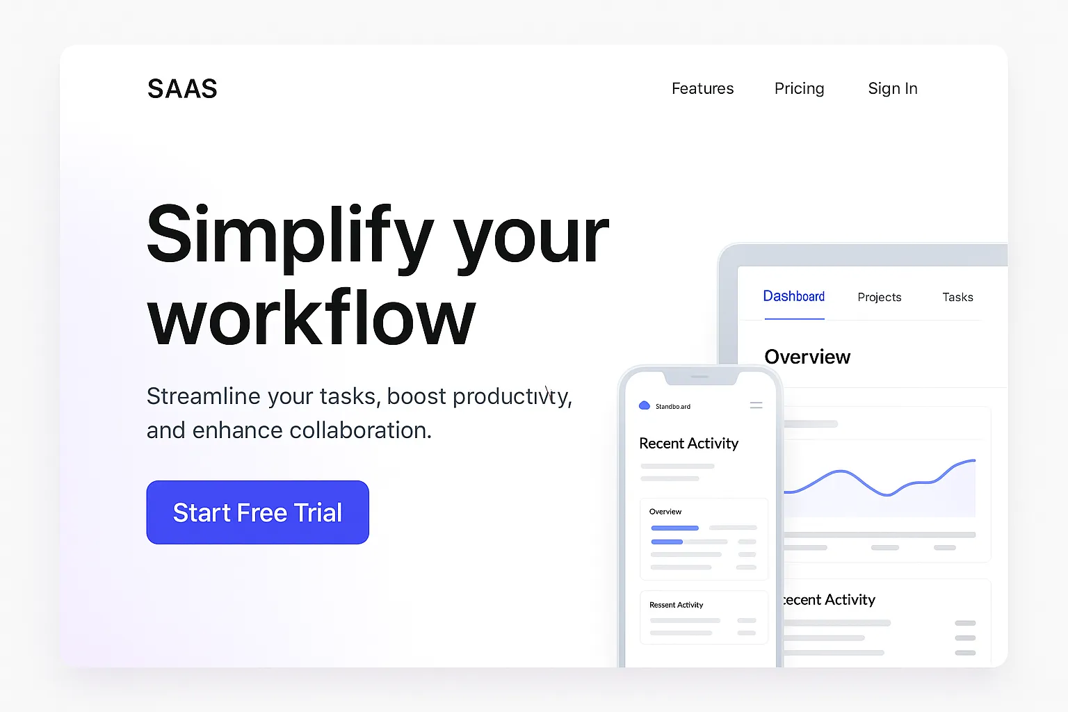
Insert Image Here: A sleek SaaS hero section mockup featuring bold text, concise value proposition, and a primary CTA button.
Internal Link: Explore Top SaaS CTA Examples
CTA: Drive the Action
Whether it’s “Start Free Trial,” “Book a Demo,” or “See How It Works,” your SaaS home page should feature CTAs that:
- Appear above the fold
- Use action-oriented language
- Recur multiple times throughout the page
Use sticky headers or floating buttons for easy access.
Show Off Your Product: The Power of Visuals
People don’t just want to read about your SaaS product—they want to see it.
Include:
- Screenshots
- Short explainer videos
- Interactive product tours
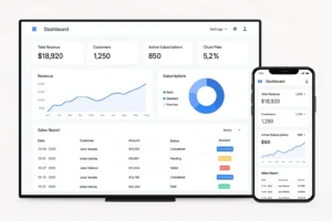
Insert Image Here: A dashboard screenshot or short demo video frame showing product functionality on desktop and mobile.
Visuals communicate trust, usability, and value faster than words. The best SaaS web design makes this easy to absorb.
External Link: SaaS Marketing Visual Examples on Dribbble
Key Features and Benefits: Solve Real Problems
Don’t overwhelm visitors with a feature dump. Focus on real-world outcomes:
- “Automated workflows that save 10+ hours/week”
- “Secure team collaboration in one centralized dashboard”
Use icons and short blurbs to present benefits. Bullet points work wonders on a SaaS home page.
Social Proof: Let Others Do the Selling
Trust signals are essential to conversion. Add:
- Customer testimonials
- Case studies
- Press mentions
- G2, Capterra, or Trustpilot badges
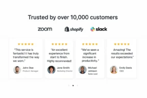
Insert Image Here: A branded carousel of company logos (e.g., Zoom, HubSpot, Shopify) or testimonial quotes in speech bubbles.
Performance & Trust Elements
Highlight aspects like:
- Data encryption and security compliance
- Integrations with major tools (e.g., Zapier, Salesforce)
- Awards or certifications
Trust builds authority—essential in any successful SaaS website.
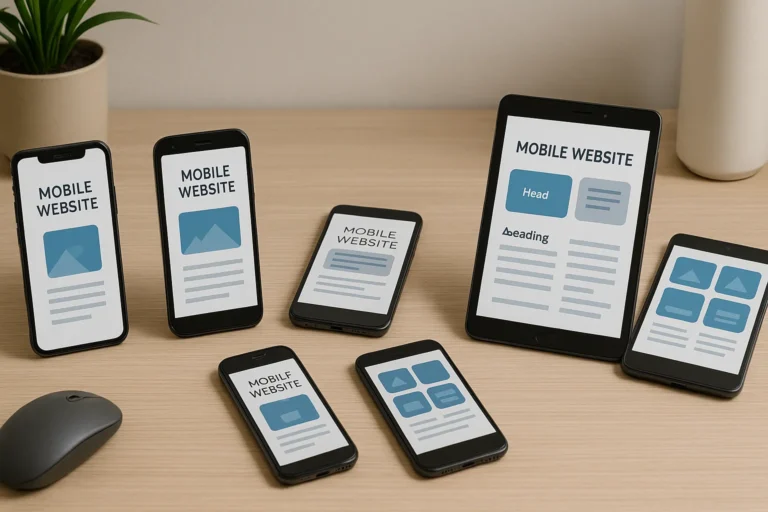
Mobile-Friendly SaaS Website Design
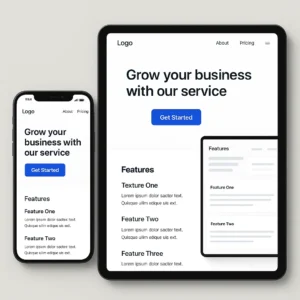
More than 50% of users now visit from mobile devices. Your SaaS web design must be:
- Fully responsive
- Fast-loading (under 2.5s)
- Optimized for thumb-friendly CTA placement
SaaS Website Examples That Set the Standard
Here are some of the best SaaS website examples to inspire your design:
| SaaS Website | What They Do Well |
|---|---|
| Dropbox | Clear messaging, whitespace, and focused CTAs |
| Notion | Interactive visuals and audience-first content |
| Slack | Emotional copywriting and benefit-oriented features |
| Airtable | Modern UI, vibrant color palette, smart product demos |
Internal Link: See Full List of Best SaaS Website Examples
SEO Optimization Tips for Your SaaS Home Page
To make sure your SaaS home page ranks high:
On-Page SEO
- Use the main keyword in your H1, intro, and 5–7 more times
- Include secondary keywords like “SaaS site,” “SaaS web design”
- Add image ALT tags and internal linking structure
Technical SEO
- Ensure fast loading with compressed media
- Use schema markup for products or reviews
- Use secure HTTPS protocol
Mistakes to Avoid in SaaS Home Page Design
| Mistake | Why It Hurts |
|---|---|
| No clear value proposition | Confuses users and increases bounce rates |
| Weak CTA placement | Reduces conversions dramatically |
| Cluttered layout | Makes information hard to absorb |
| Lack of visuals | Decreases user engagement and trust |
| No mobile optimization | Alienates over 50% of visitors |
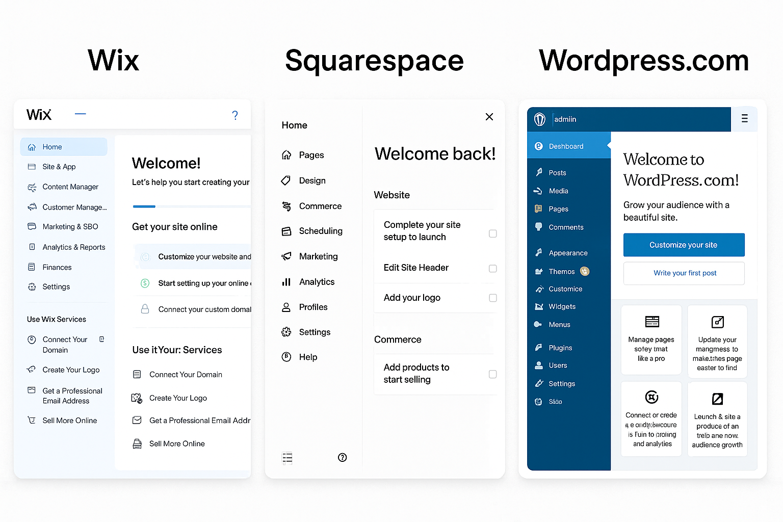
Tools to Build a SaaS Website Easily
| Tool | Use Case |
|---|---|
| Webflow | Design-first, no-code site builder for SaaS companies |
| WordPress + Elementor | SEO-friendly and flexible design control |
| Carrd | Great for MVPs or one-page SaaS sites |
| Figma | Design prototype before coding |
FAQs About SaaS Home Page Design
1. What should a high-converting SaaS home page include?
A high-converting saas home page should immediately capture attention, communicate the product’s value, and guide users toward a specific action. Key elements include:
-
A powerful hero section with a clear value proposition
-
Call-to-action buttons like “Start Free Trial” or “Book a Demo”
-
Visual previews of the software (screenshots or video)
-
Benefit-oriented feature highlights
-
Social proof such as testimonials and customer logos
-
Trust indicators (SSL badges, partner logos, GDPR compliance)
-
Navigation to pricing, support, and product pages
Each of these components must be aligned with your saas website design goals and optimized for conversions.
2. Why is the hero section so important for a SaaS home page?
The hero section is the first thing visitors see on your saas home page, and it often determines whether they scroll or bounce. A well-optimized hero should:
-
Clearly explain what the SaaS product does
-
Address a specific pain point of your target audience
-
Include a CTA button above the fold
-
Feature a visual of the dashboard or app interface
In successful saas web design, the hero section reduces bounce rates and boosts engagement. It’s a make-or-break zone for first impressions.
3. How do I write compelling copy for a SaaS home page?
The copy on your saas home page should be clear, benefit-driven, and written for your target persona. Tips for writing effective SaaS copy:
-
Use conversational language and avoid jargon
-
Focus on outcomes (“Save 10 hours a week,” “Increase revenue by 20%”)
-
Use bullet points to break up features and benefits
-
Include keywords like “saas site” and “saas website examples” naturally
Great saas website copy connects emotionally while guiding users logically toward conversion.
4. What role does social proof play on a SaaS home page?
Social proof is crucial for building trust. On your saas home page, it reassures potential customers that others like them have already found value. Common types of social proof include:
-
Customer testimonials with names and images
-
Case studies with performance stats
-
Review site badges (e.g., G2, Capterra)
-
Logos of notable clients
Many of the best saas website examples showcase social proof in carousels or near CTAs to reinforce trust at decision points.
5. Should I include pricing on my SaaS home page?
Including pricing on your saas home page can be a strategic choice. It depends on:
-
Whether your pricing is transparent and competitive
-
Your ideal sales funnel (self-serve vs. enterprise-led)
-
Your willingness to qualify leads early
Some companies offer a pricing teaser with a link to a full pricing page. This is common among the best saas site layouts that balance transparency with conversion.
6. How important is mobile optimization for a SaaS home page?
Mobile responsiveness is essential. Over 50% of web traffic comes from mobile devices, and Google’s mobile-first indexing means your saas home page must:
-
Load in under 3 seconds
-
Scale cleanly across all screen sizes
-
Use large, tappable buttons for CTAs
-
Avoid popups that disrupt mobile usability
The most successful saas web design strategies include mobile-first considerations right from the wireframe stage.
7. What are the best SaaS home page layouts?
Popular and proven saas home page layouts often follow this structure:
-
Hero section with CTA
-
Feature highlights with icons
-
Screenshots or video demos
-
Social proof/testimonials
-
Pricing preview or link
-
Footer with helpful links
This format appears consistently in top saas website examples such as Notion, Slack, and Asana. They prioritize clarity, scannability, and actionability.
8. How do I design a SaaS home page for lead generation?
To generate leads, your saas home page should integrate conversion-focused elements:
-
Email capture forms or popups
-
Lead magnets (e.g., eBooks, free tools)
-
Live chat or chatbot widgets
-
Multiple CTAs (top, mid, and bottom of page)
Make sure the user journey is frictionless. Well-designed saas sites use these features to grow email lists, book demos, and drive MQLs.
9. How do I choose the right CTA for my SaaS home page?
The right CTA depends on your business model and customer journey. Common SaaS CTAs include:
-
“Start Free Trial”
-
“Book a Demo”
-
“Try It Now”
-
“See It in Action”
Your saas home page should repeat the CTA throughout the page and use contrasting colors. The CTA should communicate a benefit, not just an action.
10. What SEO elements should I optimize on my SaaS home page?
To improve search engine visibility, optimize the following on your saas home page:
-
Use the main keyword (“saas home page”) in your title, H1, intro paragraph, and image ALT text
-
Include internal links to pricing, blog, and feature pages
-
Optimize metadata (title tag and meta description)
-
Use schema markup for reviews or FAQs
Proper SEO ensures your saas site is discoverable for both branded and non-branded search queries.
11. How often should I update my SaaS home page?
You should review your saas home page every 3–6 months to:
-
Reflect new product features
-
Update messaging to match evolving ICPs
-
Optimize for new keywords
-
Refresh testimonials or add new logos
A stale saas website can signal neglect to visitors and decrease conversions.
12. What tools are best for building a SaaS home page?
Here are popular tools to design and launch your saas home page:
-
Webflow – no-code, designer-friendly
-
WordPress + Elementor – flexible and SEO-optimized
-
Figma – for wireframing and design collaboration
-
Unbounce or Instapage – for A/B testing different homepage variations
Top-performing saas web design often comes from balancing visual creativity with performance optimization.
13. How do I highlight integrations on my SaaS home page?
To show compatibility with other tools, include an “Integrations” section on your saas home page featuring:
-
Logos of tools like Slack, Zapier, Salesforce
-
Short blurbs on how the integration works
-
Call-to-action to explore integrations page
This helps establish credibility and usability, especially for saas sites competing in crowded verticals.
14. What mistakes should I avoid on a SaaS home page?
Common mistakes that hurt saas home page performance:
-
Vague headlines that don’t explain what the product does
-
CTAs that are hard to find or generic
-
No social proof or outdated testimonials
-
Cluttered visuals and poor hierarchy
-
No mobile optimization or slow load speeds
Avoiding these errors is key to standing out among saas website examples in your niche.
15. Where can I find inspiration for great SaaS home pages?
Check out curated lists on:
These platforms feature the most beautifully designed and effective saas website examples across industries. They showcase trends in layout, typography, animation, and copywriting.
Final Thoughts: Your SaaS Home Page Is Your Best Sales Rep
Your SaaS home page isn’t just another webpage—it’s your 24/7 sales and support team. It should work hard to:
- Communicate your product’s value
- Gain trust fast
- Convert casual visitors into loyal customers
Whether you’re redesigning your SaaS website or building from scratch, remember that your homepage should serve your users first and Google second.
Ready to build your best SaaS home page ever?
Explore Free SaaS Web Design Templates or check out our SaaS Content Strategy Guide next!


I really like your blog.. very nice colors & theme. Did you make this website yourself or did you hire someone to do it for you? Plz reply as I’m looking to create my own blog and would like to find out where u got this from. thanks a lot
I am a web developer, and I developed this website myself. If you need someone to create a similar website, I can help you. Please contact me. Thank you very much for your comments.
Im now not certain where you’re getting your info, but good topic. I needs to spend some time learning much more or working out more. Thank you for wonderful information I was looking for this info for my mission.
I gotta bookmark this site it seems handy very useful
What i do not realize is if truth be told how you’re not actually a lot more well-favored than you may be right now. You are very intelligent. You already know thus significantly in terms of this subject, produced me personally believe it from so many numerous angles. Its like men and women are not interested except it?¦s one thing to do with Lady gaga! Your own stuffs nice. At all times care for it up!
Hi there,
Thank you so much for your thoughtful and encouraging message — I truly appreciate it. I’m glad the way the topic was explored from different angles resonated with you, and it means a lot to hear that you found the content insightful.
You’re absolutely right that meaningful subjects don’t always get the attention they deserve, but comments like yours make the effort worthwhile. Thank you for the motivation and for your kind words — I’ll certainly keep it up.
Warm regards,
Md Abdullah
Hi there,
Thank you so much for your thoughtful and encouraging message — I truly appreciate it. I’m really glad the way the topic was explored from multiple angles resonated with you, and it means a lot to hear that you found the content insightful.
You’re right that meaningful topics don’t always get the attention they deserve, but comments like yours make the effort worthwhile. Thanks again for the motivation, and I’ll certainly keep it up.
Warm regards,
Md Abdullah
Appreciate the insight
Hi, I think your website might be having browser compatibility issues. When I look at your blog site in Firefox, it looks fine but when opening in Internet Explorer, it has some overlapping. I just wanted to give you a quick heads up! Other then that, terrific blog!
Hi there,
Thank you very much for the heads-up — I really appreciate you taking the time to let me know. If you’re seeing overlapping in Internet Explorer, that’s definitely something I’ll look into and try to fix.
Internet Explorer can sometimes handle modern layouts a bit differently, but your feedback is genuinely helpful for improving the site for everyone.
Thanks again, and I’m glad you’re enjoying the blog otherwise.
Warm regards,
Md Abdullah
Great V I should certainly pronounce, impressed with your website. I had no trouble navigating through all tabs as well as related information ended up being truly simple to do to access. I recently found what I hoped for before you know it at all. Reasonably unusual. Is likely to appreciate it for those who add forums or anything, web site theme . a tones way for your client to communicate. Excellent task..
Hi there,
Thank you very much for your detailed and encouraging feedback — I truly appreciate it. I’m glad to hear you found the website easy to navigate and were able to access the information you were looking for without any trouble. That’s always the goal.
Your suggestion about adding forums or more ways for visitors to communicate is a great one, and it’s something I’ll certainly keep in mind as the site continues to grow. Thanks again for taking the time to share your thoughts and for your kind words.
Warm regards,
Md Abdullah
Thought-provoking
I like this post, enjoyed this one thanks for putting up. “He removes the greatest ornament of friendship, who takes away from it respect.” by Cicero.
Hi there,
Thank you so much — I’m really glad you enjoyed the post. That Cicero quote is a powerful one, and it beautifully captures how respect sits at the heart of true friendship. I’m pleased it resonated with you.
Thanks again for taking the time to read and comment, and I hope you’ll enjoy many more posts here on EchoJournal.blog.
Warm wishes,
Md Abdullah
Woah! I’m really digging the template/theme of this website. It’s simple, yet effective. A lot of times it’s challenging to get that “perfect balance” between usability and visual appeal. I must say you have done a amazing job with this. Also, the blog loads extremely fast for me on Chrome. Exceptional Blog!
Respect to author, some wonderful entropy.